Moving on to a another blog

As some of you might have noticed, I’ve stopped posting on Whatype. It has been a great ride, but as a professional I’ve moved to other ‘places and practices’.

I’m not sure if somewhere in the future I won’t have another question that needs a Whatype answer.

For the time being, I’m posting articles on a new blog digital-distribution.org about new media, iPads, applications, digital narratives, etc

If anyone has some work to post on Whatype, please do send it to me. You can read about this blog’s mission of the left column, besides this post.

Thank you so much for all your visits and feedback
All the best,

Pedro Monteiro

Posted in Design | Tagged , , , , , | Leave a comment

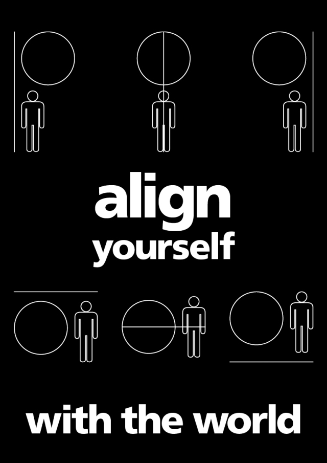
Align yourself with the world

After an afternoon aligning too much stuff in Flash I had this idea. I like this concept of aligning with the world. It has lots of meanings that you can take from it, from saving our world to help your fellow man. Please let me know your readings of this poster on the comments.

Poster: A2 Type: Frutiger Black

By: Pedro Monteiro

Posted in Design, Typography | Tagged , , , , , | 1 Comment

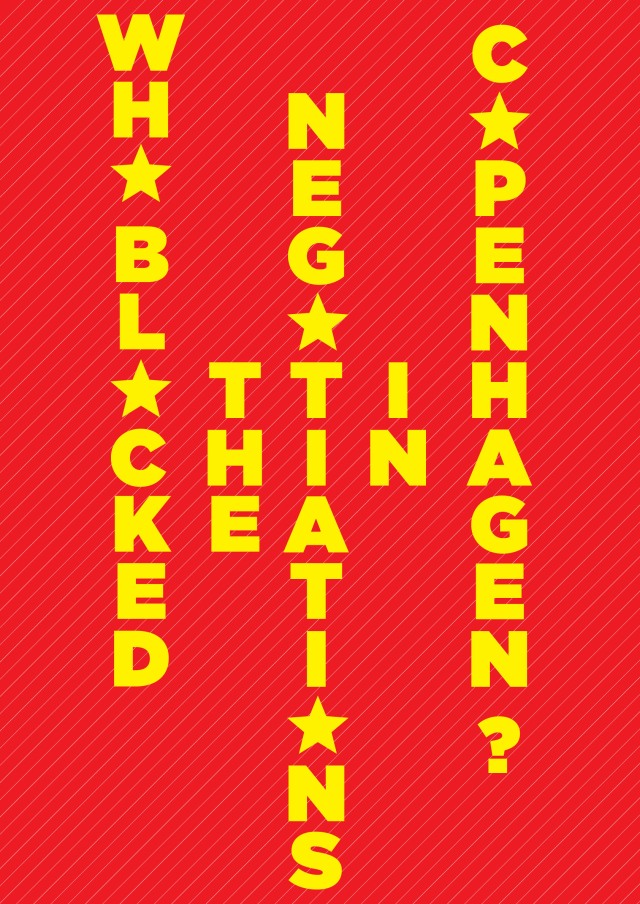
Failing in Copenhagen

I’ve just read this amazing article by Mark Lynas on the Guardian website about the Copenhagen Summit.

I did this poster about it. It just makes me very angry that politics is placed before our rights as humans and the survival of the Earth as we know it.

By Pedro Monteiro

Posted in Design, Typography | Tagged , , , , , , | 1 Comment

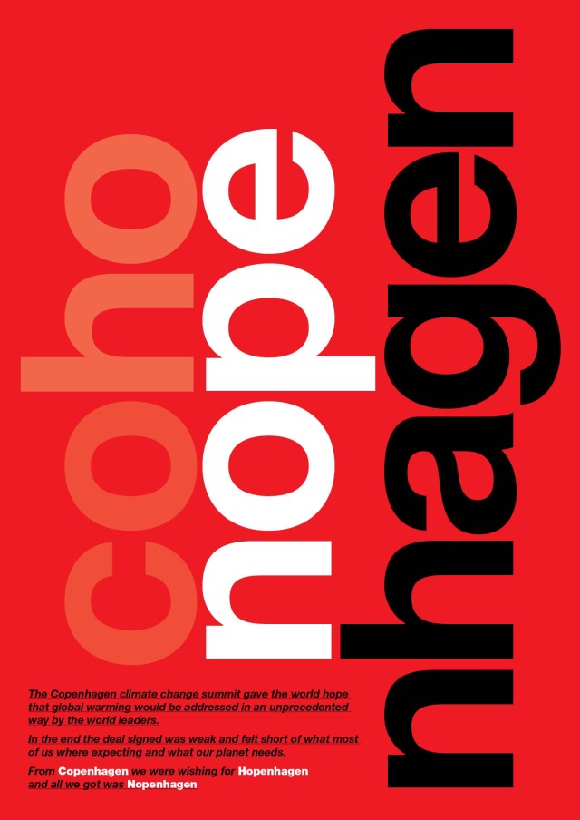
Copenhagen and Hopenhagen goes Nopenhagen

The Copenhagen climate change summit gave the world hope that global warming would be addressed in an unprecedented way by the world leaders.
In the end the deal signed was weak and felt short of what most of us where expecting and what our planet needs.
From Copenhagen we were wishing for Hopenhagen and all we got was Nopenhagen.

I’ve made this poster freely based on a 1960 Helvetica poster made by Hans Neuburg and Nelly Rudin.

Poster: A2 Type: Helvetica

By: Pedro Monteiro

Posted in Design, typographic grid, Typography | Tagged , , , , , , | 4 Comments

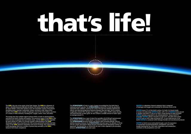
What type of life shall we have?

This is another great photograph from NASA. With pictures like this designing something is soooo easy!!!!

Since COP15 is on the run I thought I might show how life on this planet hangs from (literally) a thin blue line. On the picture you can see just how small in proportion the atmosphere is and to imagine that in there lies all the we need to live.

By: Pedro Monteiro

Poster A2, Type: Frutiger

Posted in Design, typographic grid, Typography | Tagged , , , , , , , | 1 Comment

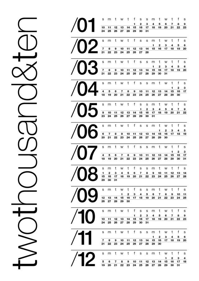
2010 Calendar done with the Complex Grid

2010calendar

This is the Whatype 2010 Calendar. I’ve done using the Complex Grid. It’s almost an year since I’ve posted the article for this kind of grid and it has had a lot of views. I thought that making something using this grid and explaining the details could be fun and useful.

One of the advantages of making a grid with the care that takes to make a complex grid is that after all the work is done it’s really easy to make everything fit perfectly and our design almost ‘creates itself’. Since the Complex Grid divides the page in 2‘s, 3‘ , 4‘ and 6‘s; I had to use the 6 division to place two months. On this grid I’ve made there are 11 lines for each division of 6
Picture 4

So each month will take 4 lines and there will still be 3 lines left for the rulers. As we know, text bellow a ruler should be closer to the ruler than the text that stand above a ruler. This gives a more appealing visual effect.
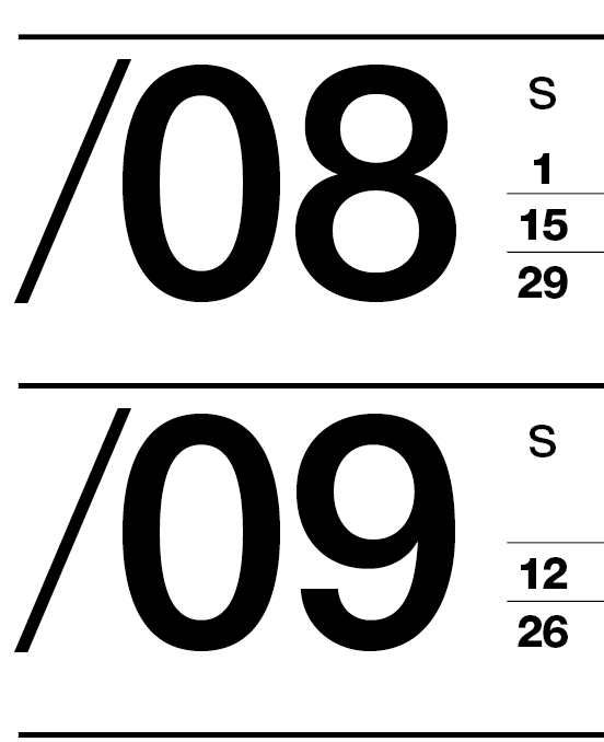
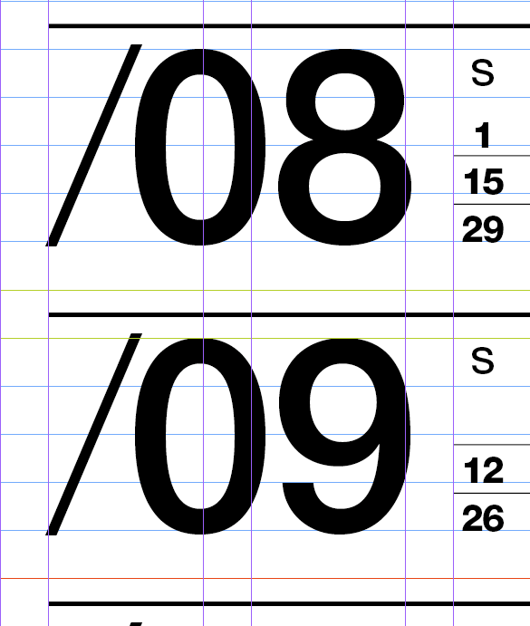
Picture 6

Picture 7

On the above pictures you can check how I’ve made this (without the guides for the visual effect and with the guides to see how the placing was made).

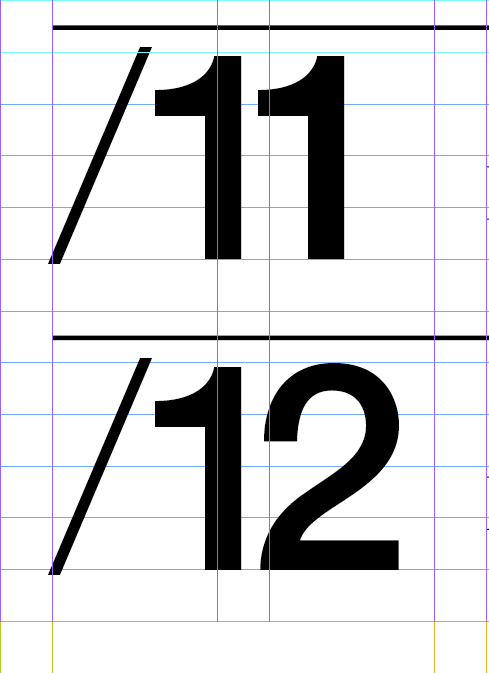
As a designer should know ‘God is in the details‘. For the alignment of the bottom text; the 12 aligns exactly with the axis of the letter t. The size of the type for the large words in vertical allows for the horizontal slash of the first t to be exactly the height of a line as you can see in the following image.

Picture 5

Making a grid like the Complex Grid also ensures that the margins, the gutters and the columns all relate in proportion with each other, with the page and with the leading. As you can see in the next image, the position of the different items of this design all fit perfectly in the grid. The months take two thirds of the type area and the title (with white space) takes one third. The title area is also divided in two parts.
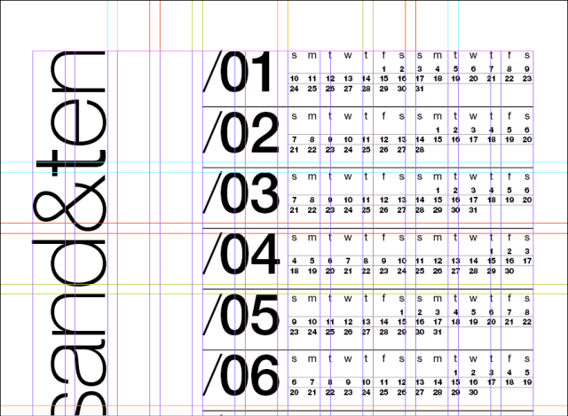
Picture 2

Further more you can also see that the space occupied by the text twothounsand&ten is the same as the white space to it’s right. That white space is twice the white space of the margins. You can see it in more detail on the image bellow.
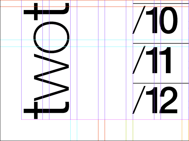
Picture 3

To finish the explanation; since you are also setting the document grid to fit exactly with the leading (and the columns, the margins, the gutters, etc) you can easily make fine adjustments to your type, the alignments and even the type sizes. Check it out in the next image.
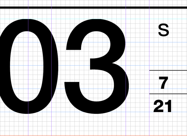
Picture 8

I hope you like this explanation and the calendar. Please comment or e-mail us your thoughts. I’ve made this calendar in A4 but it can be printed on A3, A2, etc… For printing one you can download the pdf without guides here or with the Complex Grid guides here.

By: Pedro Monteiro type: Helvetica

Posted in Design, typographic grid, Typography | Tagged , , , , , , , , | 13 Comments

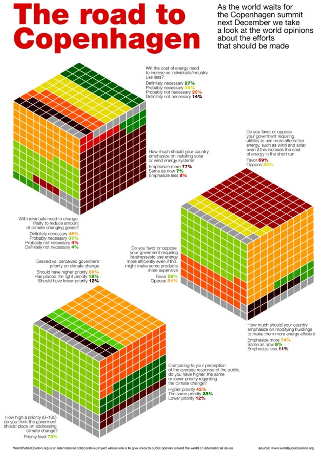
The road to Copenhagen Summit

Print

As the world waits for the Copenhagen summit next December we take a look at the world opinions about the efforts that should be made. What’s amazing with this data from World Public Opinion is that the majority of the world’s population is looking forward for their government’s to address this issue. People are ready to take upon them some burdens if they feel it helps healing the world.

What we like about this is that politicians should look to the Copenhagen summit without fear of loosing their people’s support even if they need to make some changes in some comfort areas. This means that there is a real possibility to finally take measurements that really matter to the world and the climate change.

Poster: A3, type: Helvetica
By: Pedro Monteiro

Posted in data visualization | Tagged , , , , , , , , , | 1 Comment

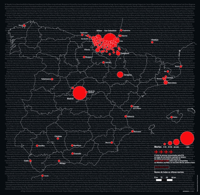
Spain and the 50 years of ETA

ESPANHA ETA

This is an visualization/illustration that I’ve made for an article in Visão, Portugal best selling newsmagazine.

The story was about the 50 years of ETA and I wanted to show every attack that ETA did in Spain that lead to a killing.

We’ve set a scale for the circles and to help understand the number of victims I’ve placed their names as a back ground.
This visualization wasn’t meant to be an exact tool to allow the readers to see every single attack; instead the goal was to present an idea of the large number of attacks and it’s victims and have a visual impact of this drama.

Posted in data visualization | Tagged , , , , , , | 4 Comments

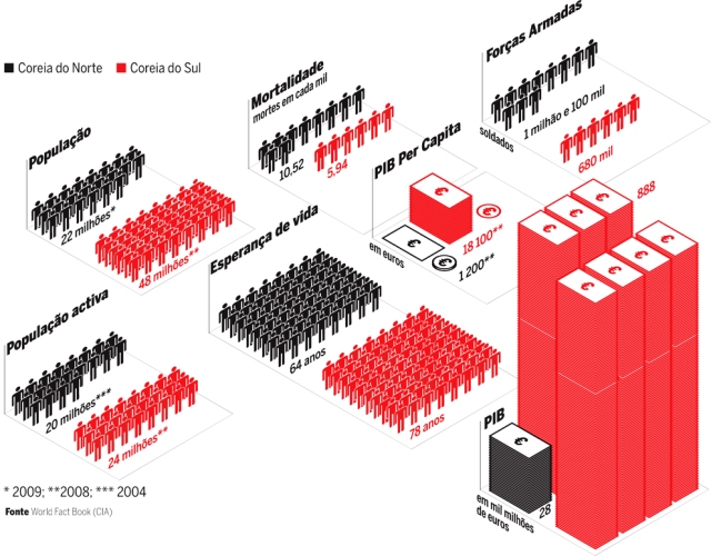
North and South Korea

coreia

This was a small work that I’ve made for Visão, Portugal best selling newsmagazine.

The idea was to compare North and South Korea on a number of things.

I’ve used the isometric approach before (as you can see in my photostream) and wanted to improve on it. This small visualization looked as the perfect little project to do so.

Posted in data visualization | Tagged , , , | 1 Comment

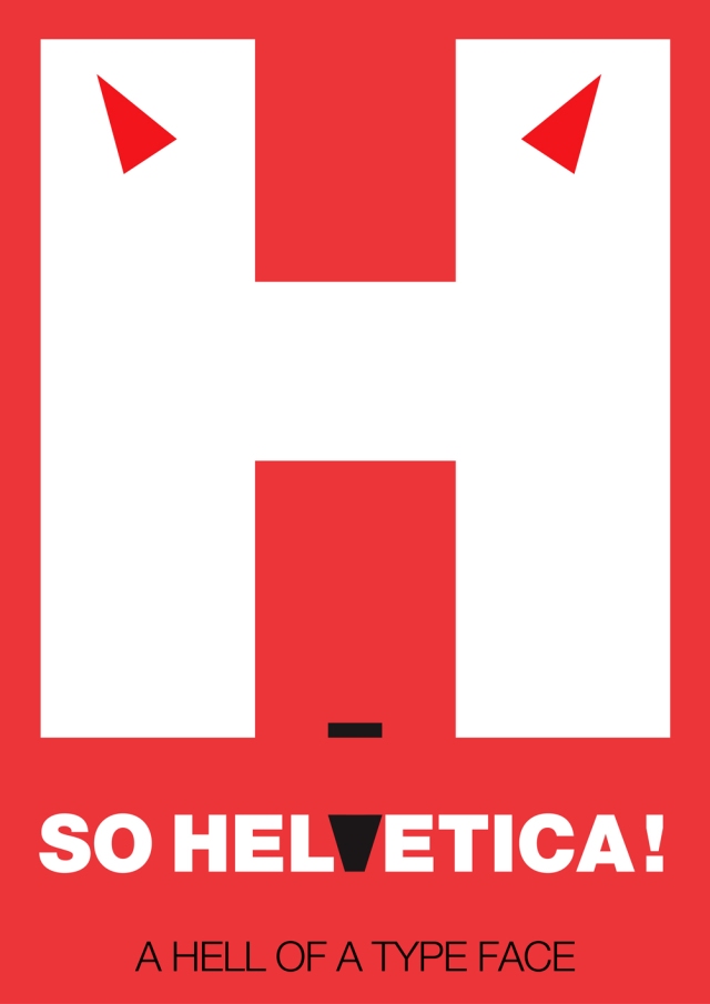
Helvetiva – a hell of a typeface!

Print

A simple idea I had driving home after work. It’s really a hell of a typeface. Hope you like it!

Poster: A3, Type: Helvetica

By: Pedro Monteiro

Posted in Design, Typography | Tagged , , , , | 1 Comment